
404Sight is a 3D running game developed over the course of about 18 months for a graduate thesis project. The game mechanically explores visual feedback to the player, the theme of the game is based around expressing the ideas of Net Neutrality in game form.
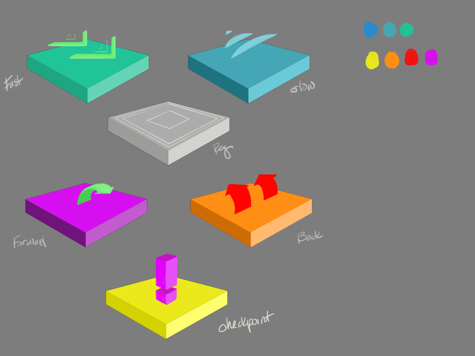
The visual feedback portion of the game began easily enough – green lanes go fast, red lanes go slow. But three weeks into the development process we discovered through playtesting that our colorblind players couldn’t play the game. This shifted the design of the visuals toward being inherently accessible to color blind players. I fought against the idea of a “colorblind mode” because it was an extra step players had to take to enable the full experience, which was one step too many for me. I designed an early iconography to the game and redid the color palette to have more contrast.
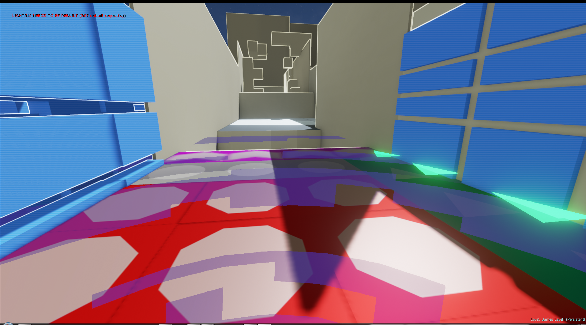

When testing the new system it was generally well received, colorblind and full color players alike could easily make out the icons. But there were still a few problems. Because of the arrows on the fast tiles, players assumed they acted as a more of a treadmill, propelling them in one direction instead of allowing them to speed along in any direction. The launch tiles also indicated a line of motion that was inconsistent with player expectation. The tile system was replaced with a better, less expensive technology, so both of these problems went away as the whole iconography and lane system had to be redesigned.

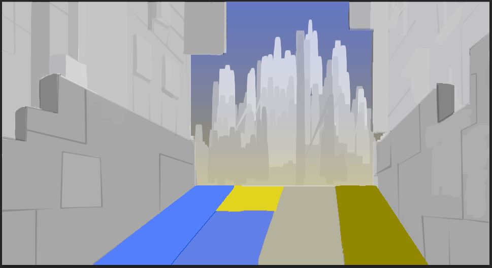
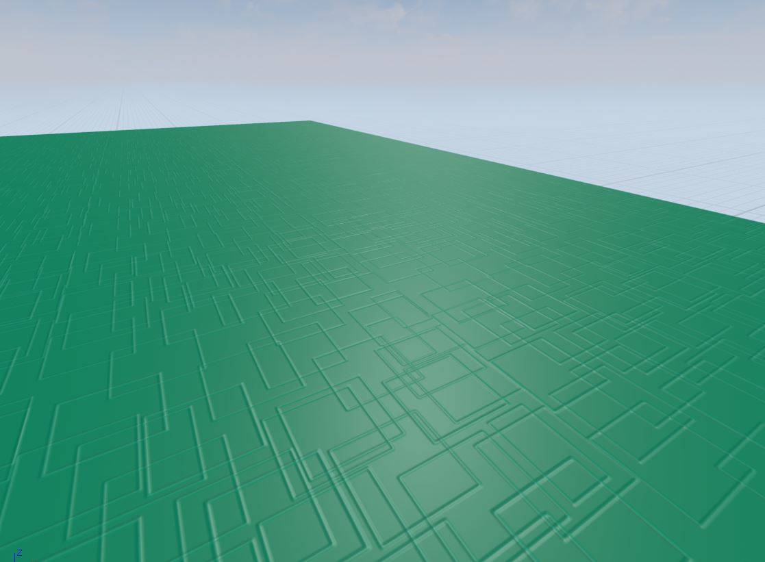
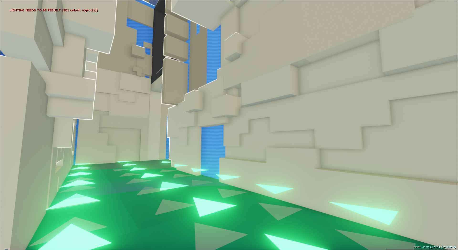
Using Unreal 4’s decal system changed the game’s feedback for the better. We were no longer restricted to tiles and we no longer had to depend on right angles for the design of the levels. This meant the iconography could now be made tileable and spread across larger areas of the world.  We decided to ditch the floating shapes as they were part of the directional problem,  and I created a new direction-free pattern to distinguish the fast and slow lanes. The new system went through many iterations, contrast had to be tweeked, adding a normal map to the textures helped make the pattern stand out more, and the shapes were revised to reflect new textures and environment art.

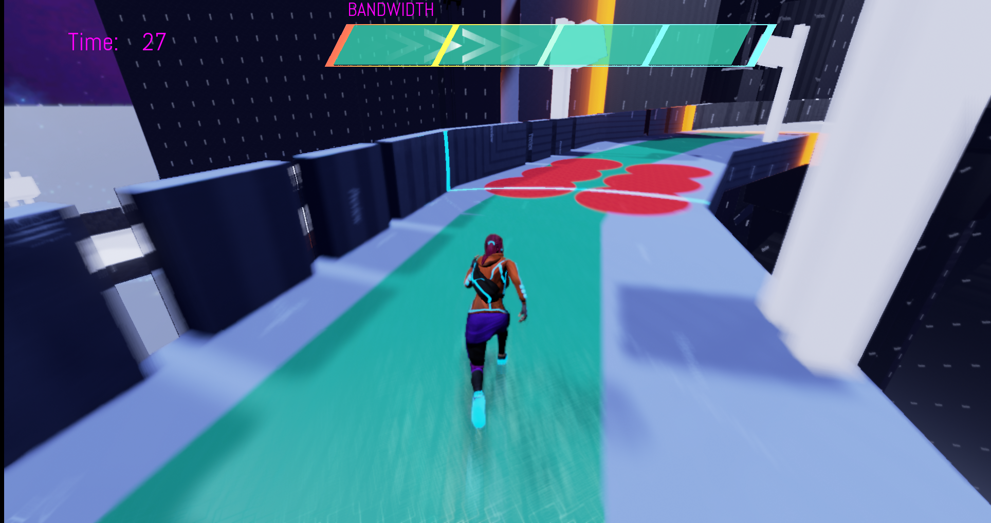
The in-game HUD was used to indicate the player’s “bandwidth” or their ability to use the ping ability to find the safe areas. If you’re in the green, you’re good to go, if you’re in the red, use sparingly. The different height bars were used to reinforce the idea of quantity and importance.
The meter was also reflected on the glowing stripes on the main character’s model. She glows green when the meter is full, red when depleted reinforcing how much bandwidth the player has without their eyes ever leaving the middle of the screen.